New packaging design respecting tradition.
Redesign symbolising quality and high efficacy.
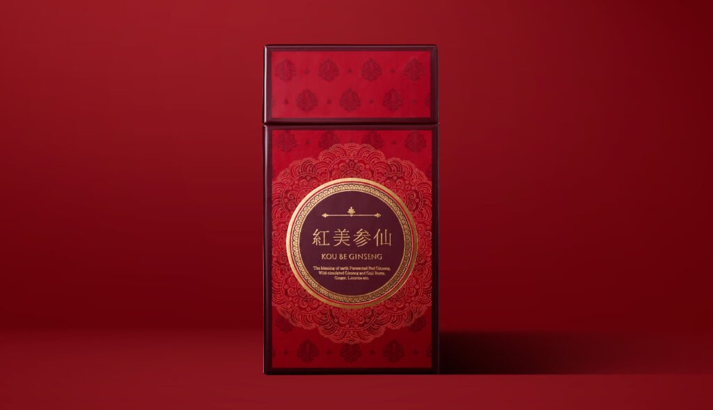
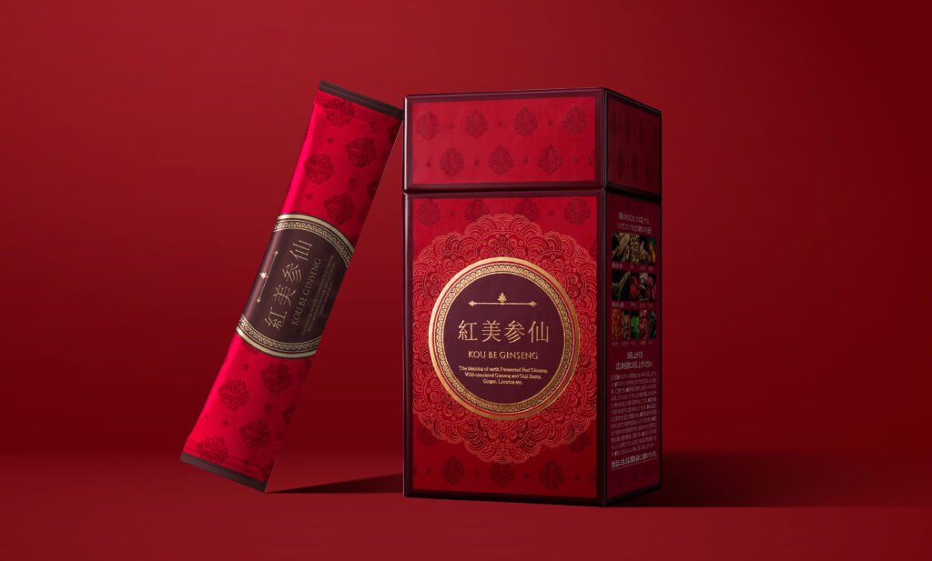
KOU BE GINSENG is an inner care product using ginseng. This product is made from ginseng in jelly form and packaged in a stick pouch. While paying homage to the historical material of ginseng and Korean culture, the essence of the ginseng has been incorporated into the product and a luxurious and beautiful design has been pursued. The base colour is red, which evokes one of the product’s benefits – improving blood circulation and warming the body – and a gold ring with a fine pattern is laid out around the logo to symbolise the sense of rarity and luxury of the carefully selected precious materials used in the product.
Finding the best solution for the sales channel.
As the main mail-order business is through print media, the aim was to create a design that would stand out on paper even as a stand-alone product and overflow with a unique world-view. As the design was a redesign of a conventional product, it was developed while paying attention to continuity with the conventional product, for example by retaining motifs used in the past in the design elements, in consideration of product recognition by buyers.
Project : KOU BE GINSENG
Credit : Creative Director Kan Yasuma / Art Director Yoshiaki Kouda / Art Director Akira Inoue /Art Director Yasuko Tingey / Designer Yusuke Kanai
