Trusted doctors’ cosmetics.
Creating a brand of beauty products that symbolises a female doctor who has answered the concerns of 200,000 people.
In listening to our clients, we were convinced that our sincere attitude as dermatologists who have been close to many people’s problems would be at the core of this brand. We built the brand with the aim of creating a trustworthy doctor’s cosmetic product that can differentiate itself from others.
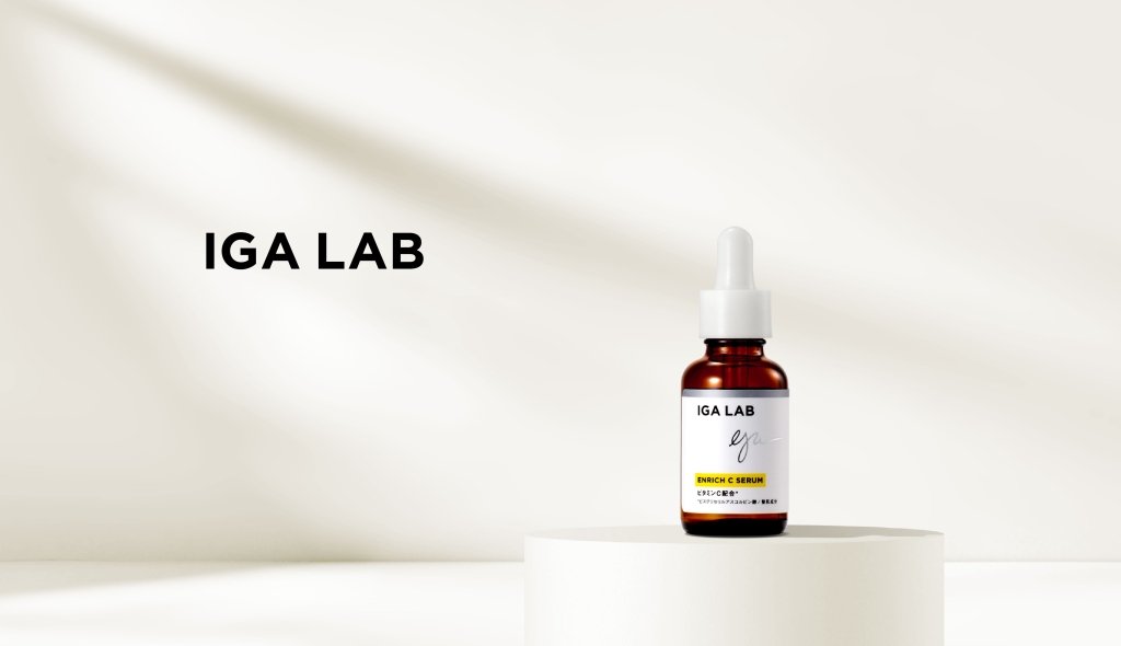
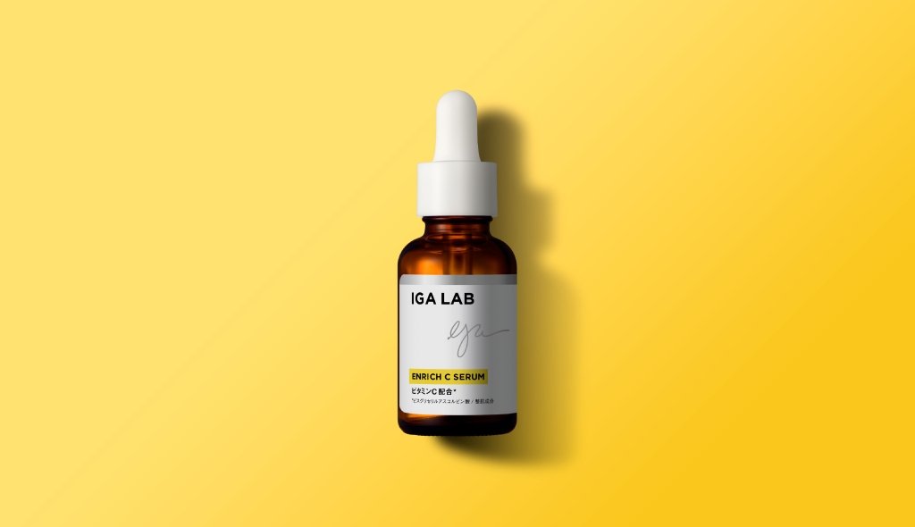
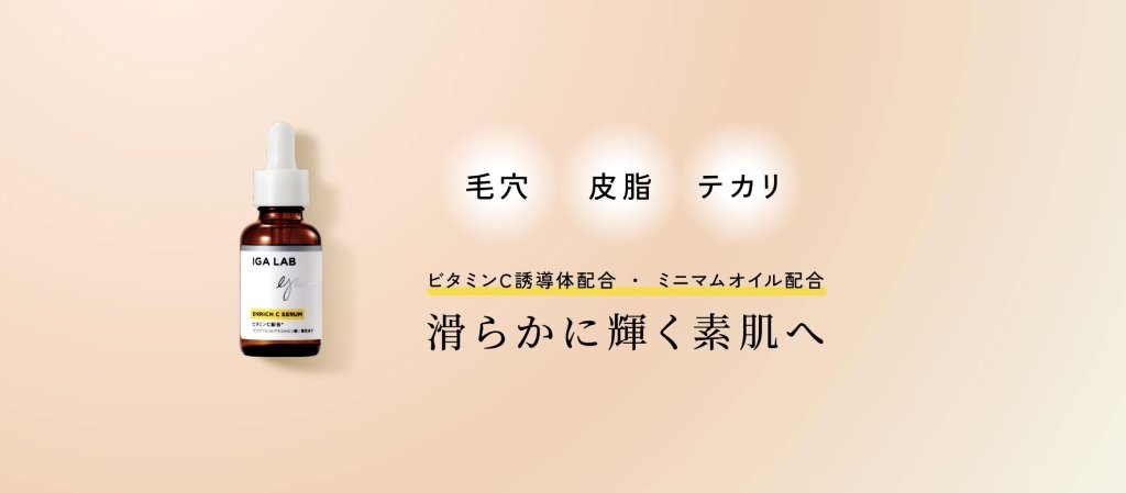
Packaging depicting a friendly atmosphere and reliability.
A clean white colour scheme was used as the base colour, with silver lines to give a medical feel and yellow highlights to evoke vitamin C (for its skin-brightening effect) to divide the range of products. The simple graphic design with no superfluous elements and the handwritten signature of a female doctor further enhanced the credibility of the product.
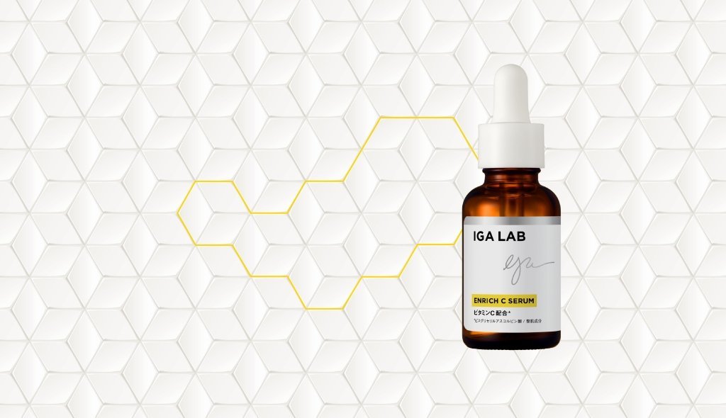
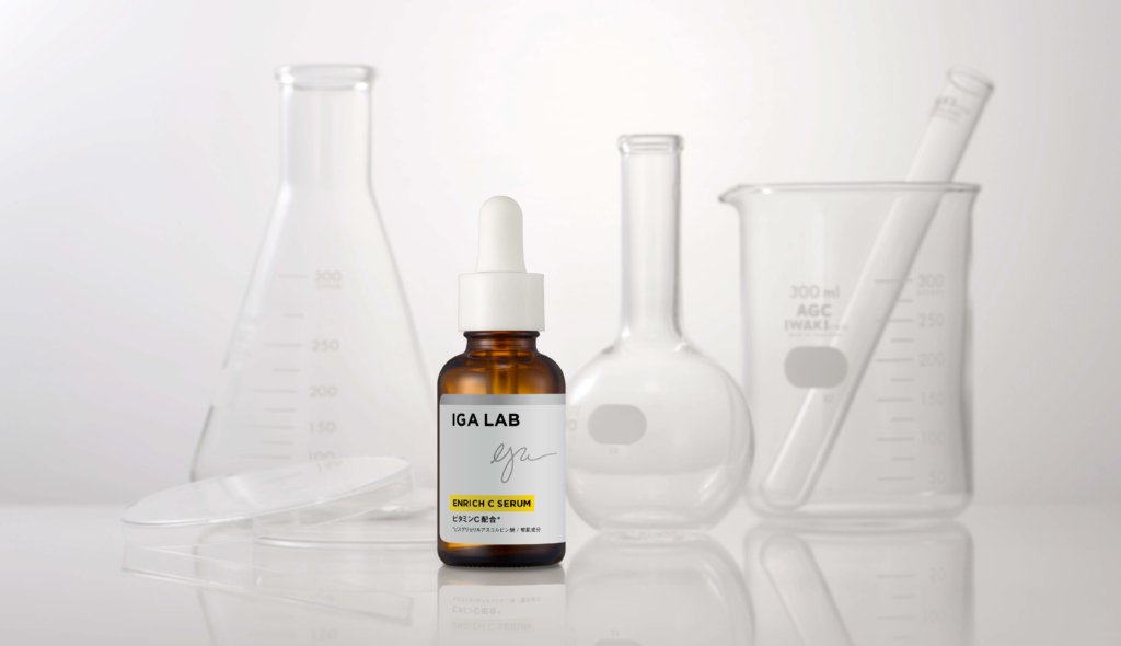
Key visuals evoking chemistry and skin cells.
As a trusted doctor’s cosmetic, the geometric pattern is beautifully developed to reproduce a chemical feel and skin cell image.
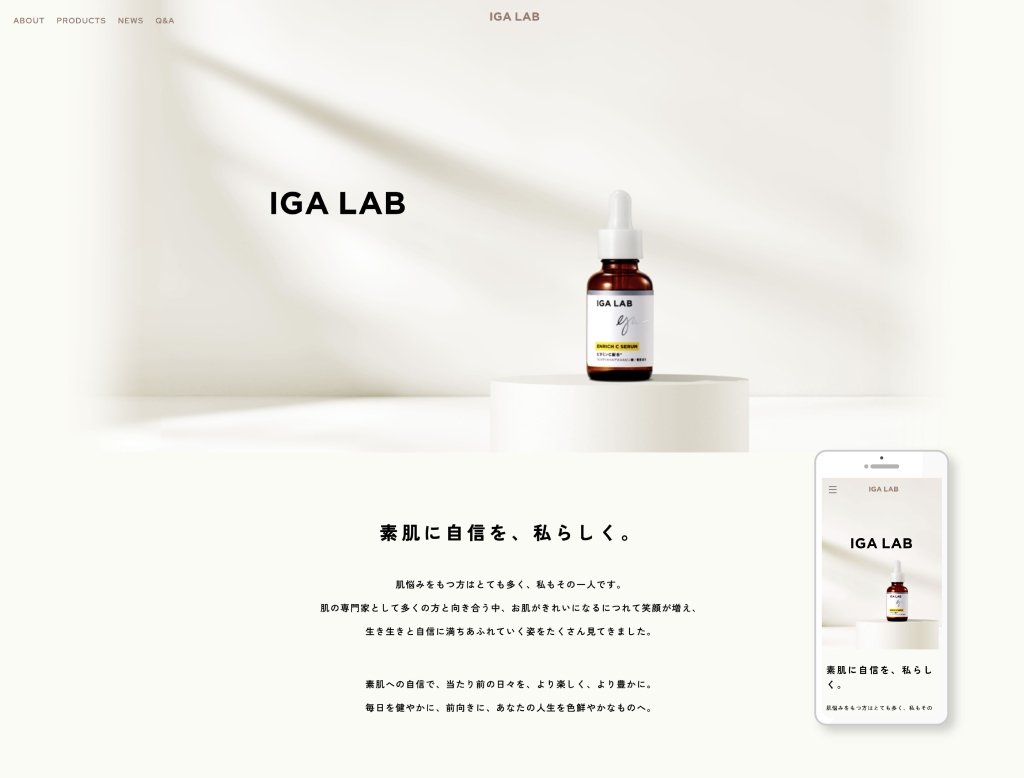

Creating a trustworthy website
We tried to create a simple but trustworthy structure that summarises product information such as active ingredients and benefits in an easy-to-understand manner. The packaging design, key visuals and website were produced in a unified manner to clearly convey the brand’s world view.
Project : IGA LAB
Credit : Creative Director Kan Yasuma / Art Director Yasuko Tingey / Art Director Akira Inoue / Designer Yusuke Kanai / Photographer Yasuhiko Kawashima