Helping the owner and his wife to create a shop that is well-loved by the local community.
New style wine shop.
We provided branding and design support for the creation of a new style of shop: ‘a friendly place where families with children can easily come in and a specialist wine shop that will satisfy even the most discerning wine connoisseur’. We created a concept board with a storyline that evokes the owner and his wife travelling around France in search of good wine, to create a shared awareness with them. The wine shop started in Futakotamagawa and has since expanded to Yokohama and Shibuya.

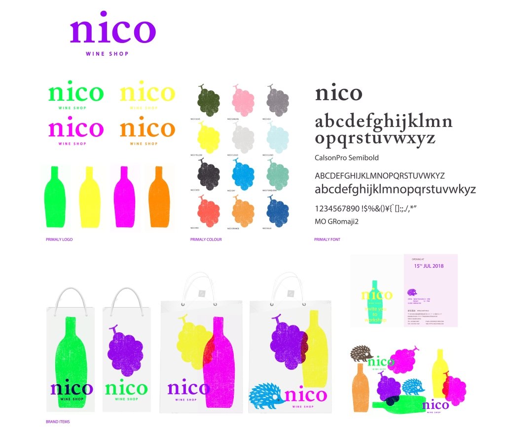
Crafted logos and icons that make stories spring to life.
We aimed to create a cheerful logo design that would be easy to enter for young women with an awareness of Futakotamagawa. In terms of the brand’s colour scheme, we used a grape green and purple theme, reminiscent of white and red wine, to maintain visibility; we used bright shades so that the paper bags of people who have purchased products from NICO are easily recognisable from a distance; and we used a colour palette that is reminiscent of the wine bottles and grapes that are used at NICO. Graphic elements such as grapes, wine bottles and hedgehogs were used to give the design a crafted feel, as if a story was springing up.
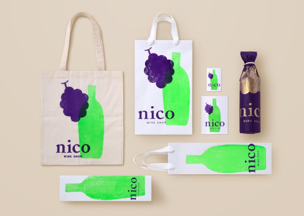
Gift packages aimed at publicity.
The paper bags have an advertising effect when people who buy them carry them around town. For this reason, we proposed an eye-catching structure with a large logo on the paper bag and the bottle box, with vivid colours to bring the story to life.

Premium gift packaging for someone special.
The furoshiki gift was adopted to create a unique and impressive gift item. The design was based on a subdued colour scheme with beautiful colour inserts to give the recipient a sense of nico’s world view and to make it easy to use afterwards.
Project : nico
Credit : Creative Director Kan Yasuma / Art Director Yasuko Tingey / Art Director Akira Inoue / Designer Yusuke Kanai