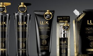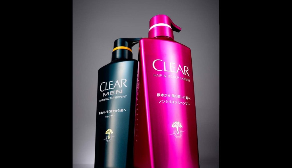
Brand development for the first time in Japan
New packaging developed for the Japanese market, from bottle shape to graphics.
While following the unique brand image of the Clear brand in the USA, we worked on the development of an integrated design for the Japanese market, from the consideration of the bottle shape, colour and texture to the packaging design.
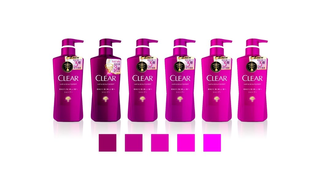
Coloured packaging based on the concept of a tough female figure.
The Clear brand in the US targets women for non-silicone shampoo and men for shampoo. For sales in Japan, as the colours in the home country would be buried in the market if they remained the same, we considered striking colors and colors that represent tough female elephants as a new brand appearing for the first time.
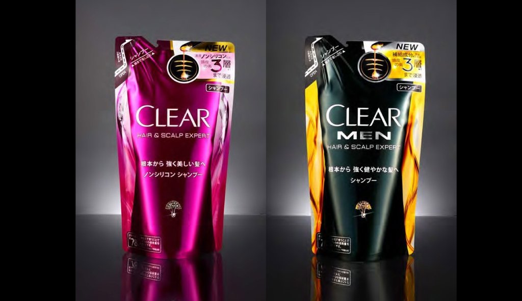
Refill design for in-store differentiation.
As refills are the same shape for each company, in order to differentiate them in the shops, we focused on glossy colours and devised a way to include a water stream on the side, symbolising transparency.
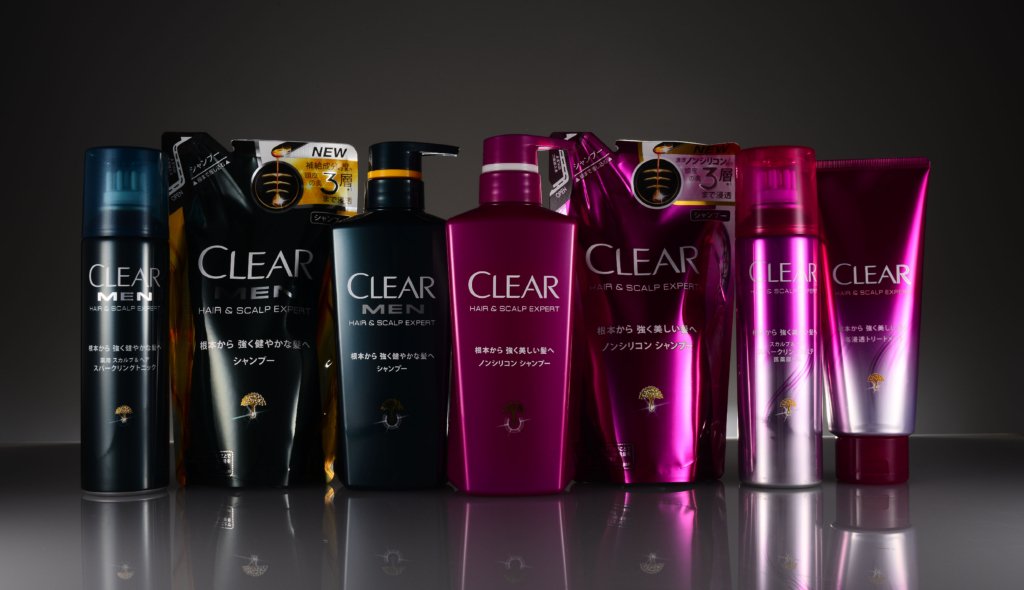
Adaptation was adapted to create a unified but individual face.
Development into bottles, refills, tubes and sprays, containers of different shapes and materials. Colours were adjusted and graphic elements were added to make each item eye-catching in the shops where they are displayed, while maintaining a sense of unity as products representing the brand. Great consideration was given to the printing method, as different materials have different printability.
Project : CLEAR
Credit : Creative Director Kan Yasuma / Designer Yusuke Kanai