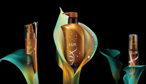
Development of a new series of top-of-the-range lines.
Lux Prestige Line New development of the BIO FUSION Black Series.
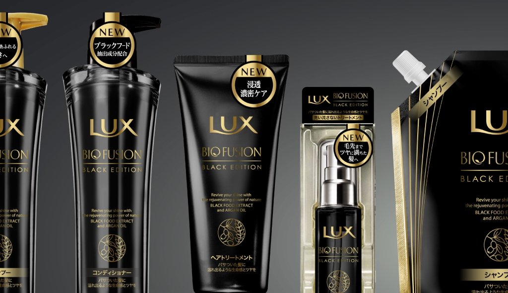
A new series based on the concept of ‘the power of black coloured food’ will be developed in the existing BIO FUSION range. This project focuses on the power of black foodstuffs found in nature and creates a new face within the Lux top-of-the-range line. It is an unprecedented design that expresses the botanical element of ingredients in the world of black, a symbol of luxury. We designed everything from the choice of colour to the original icon and packaging.
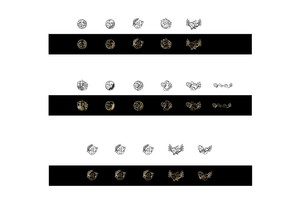
Production of icons with symbolic designs of the active ingredients.
In response to the client’s request to use the active ingredient of black food as it is in the icon, we designed the blackberry symbolically and proposed several ideas.
As the design stipulated that black should be the base colour, the botanical element of the blackberry was expressed in a hard metal-like form, emphasising a sense of luxury and good looks.
Packaging focused on the black colour that brings out the luxury and strength of the product as the highest quality.
In order to create dignity as a product of the highest line, we proposed several types of black colour, matte black, glossy black, etc., to give a feeling of luxury and strength.
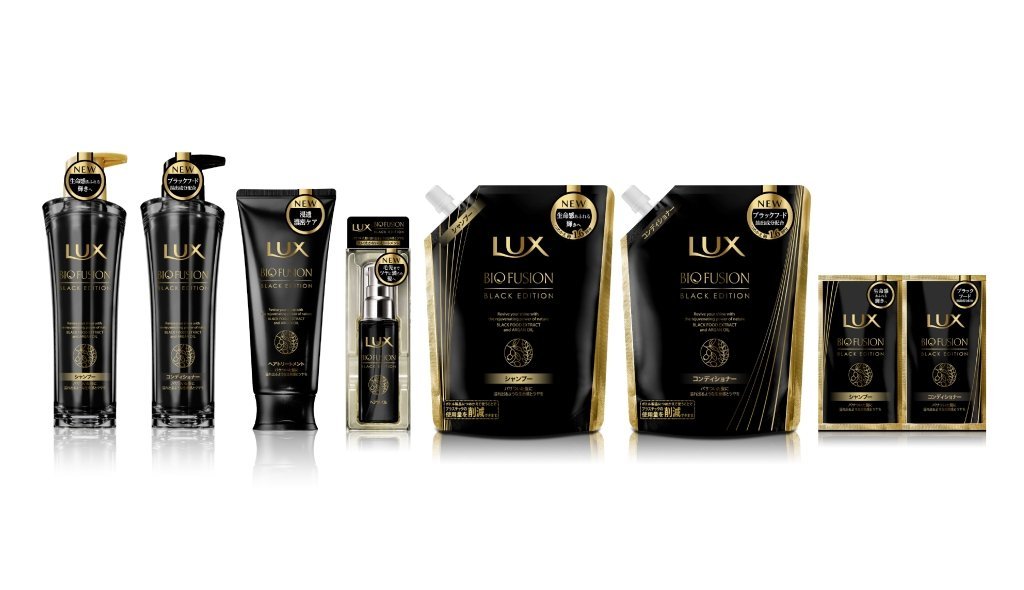
Variant development to enrich the brand
We created variation in different sizes, shapes and materials, while maintaining a sense of unity. As the colour scheme is all black, elements were added in parts to create a development plan that is not monotonous and useful for identification.
Project : LUX BIO FUSION
Credit : Creative Director Kan Yasuma / Art Director Yasuko Tingey / Art Director Akira Inoue / Designer Yusuke Kanai