Packaging design for people and nature in a world 100 years from now.
Redesign for clarity and uniformity.
Older products had no set rules in terms of packaging design, and the design and colours changed with each product launch, resulting in a loss of uniformity. This was confusing for consumers, undermining their understanding of the brand and undermining its strength as a brand. The aim of the renewal was to reorganise the design and push the brand’s strengths further forward without losing existing customers. The aim was to let people know about the world view of Morgan’s, rather than looking at the products in isolation. The brand’s slogan:”10 years from now, you can still use our products with peace of mind. And for people and nature in the world 100 years from now to be more beautiful than they are now.” was designed to be experienced through the brand.
Colour schemes with branding
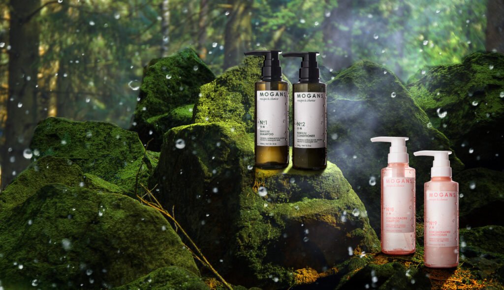
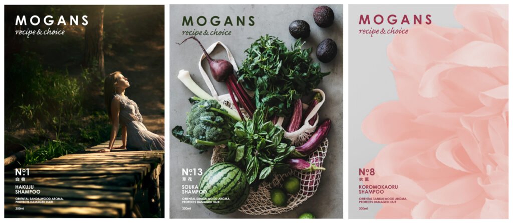
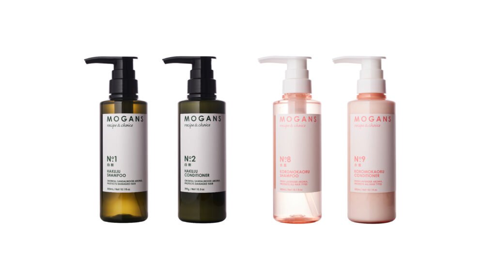
We used natural deep green for the basic base colour, pink for products with flowers, and other easy-to-understand colour-coding to blend in with the deep green of the natural world. For the key visuals and other image shots, we found a rule for photography, such as choosing photos with a story to convey the world view. Each of the existing products was given a product number, and we succeeded to these so that existing consumers could continue to select the same product after the relaunch. New customers were then given not only a number, but also a memorable Chinese characters product name, from which they could imagine the fragrance and background.
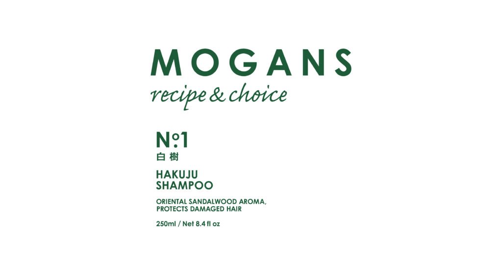
The logo with a modern typeface that can continue for the next 10 years and beyond.
The aim was to provide simple textual information that clearly communicates the product number and name to consumers, as well as trend-setting typographic expression.
Packaging design that brings the actual bottle and the online world together.
We focused not only on the impression the product makes when you pick it up, but also on how it looks on social networks and online stores in front of it, in order to unify it as a brand and reduce the gap when it appears in the shops.
Project : MOGANS
Credit : Creative Director Kan Yasuma / Art Director Yasuko Tingey / Art Director Akira Inoue / Designer Yusuke Kanai