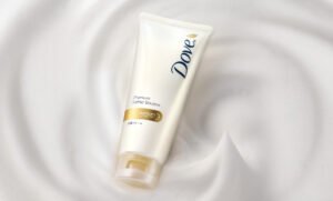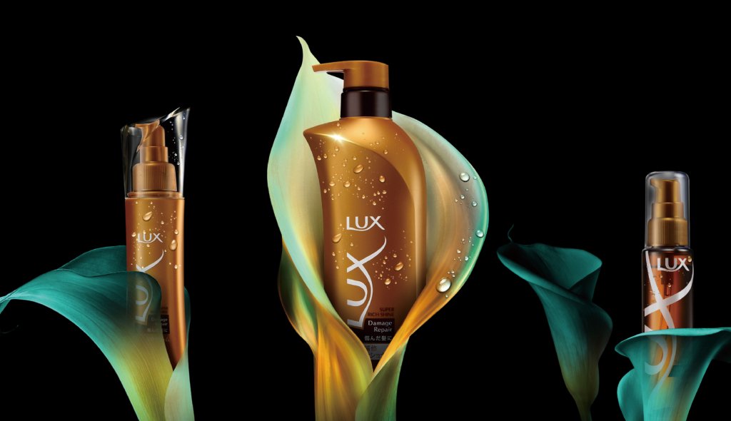
Colour accentuates the individuality of the two main lines.
Designed with a luxury update in mind.
In renewing the two main lines, the colours and textures were designed to reproduce an even more luxurious and high-quality feel, while maintaining the original colours of the brand.
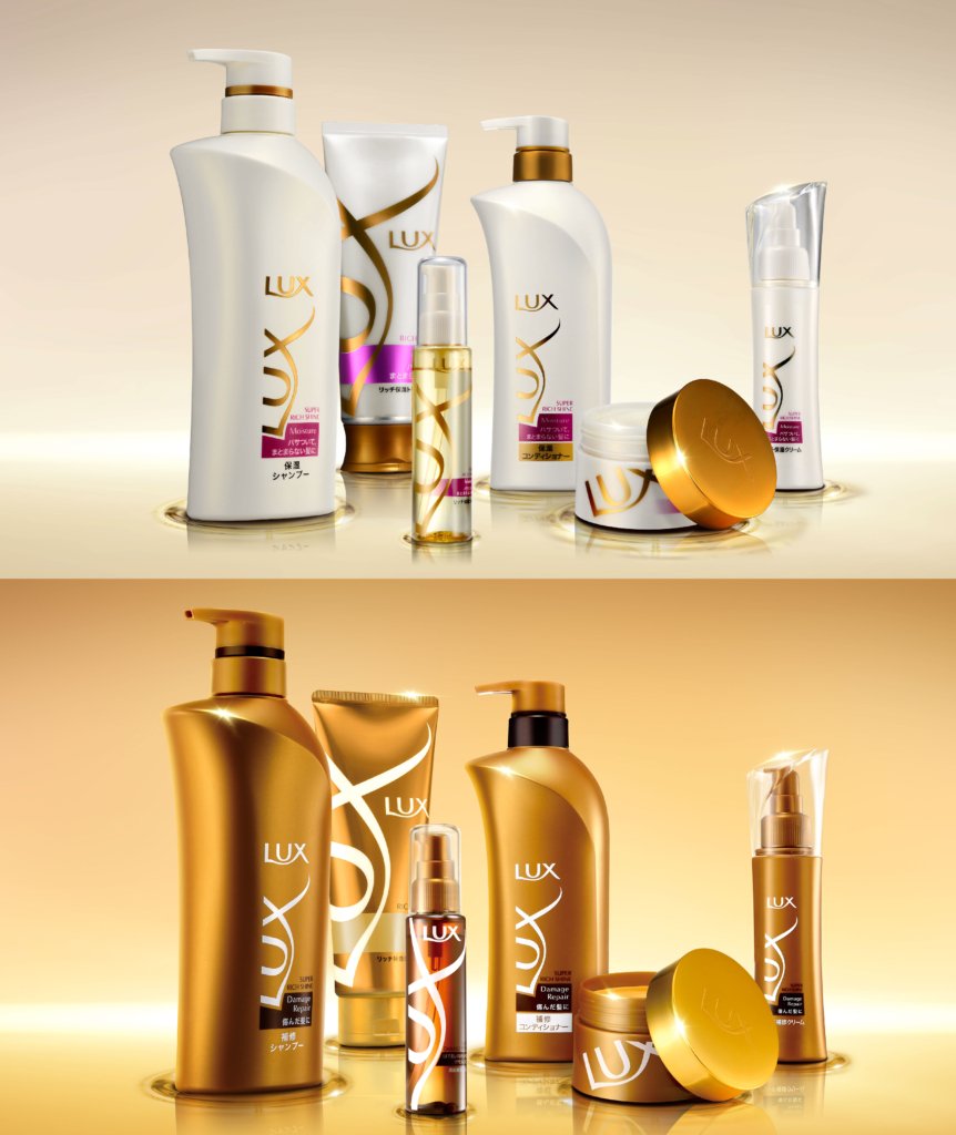
Packaging with a focus on colours that represent the brand image.
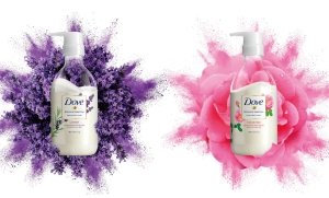
A gorgeous and feminine brand image expressed through the words ‘Hollywood actress’. Multiple colour studies were conducted to ensure the brand was expressed through the colours. For the Moisture series, we proposed a moist, pearlescent sheen that expresses freshness, while for the Damage Repair series, we proposed a brighter bronze that gives the impression of a wider colour range depending on the light. The series, which was added to the range due to popular demand, was also introduced in a feminine pink colour that distinguishes it from its predecessors.
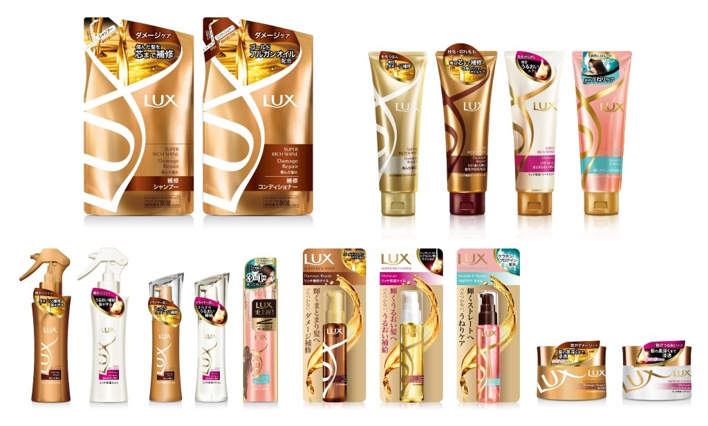
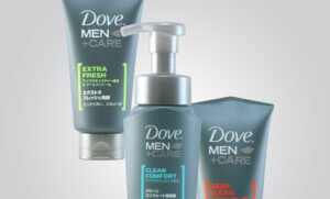
Development variants while maintaining brand unity.
We have created a developmental variation to containers of different sizes, shapes and materials, while maintaining a sense of unity.

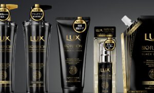
Banners that catch the eye and attract even when screens are flooded with information.
It is very important for a banner to catch the eye on a screen full of diverse information on digital devices. We also focused on organising the information so that it is conveyed in a straightforward manner in a small banner.
Project : LUX SUPER RICH SHINE
Credit : Creative Director Kan Yasuma / Art Director Akira Inoue /Designer Yusuke Kanai / Photographer Yasuhiko Kawashima